Thursday, 10 May 2012
Wednesday, 9 May 2012
Sunday, 6 May 2012
Client Requirements - Fashion Shoot.
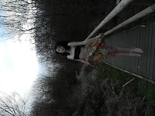
With
this photo I started by applying an Infrared filter to it. I then increased the
brightness a lot, and then adjusted the contrast slightly. I did this because
the girl stands out more as she has a lot of black on her, where as the background
is more white/grey tones. I then cropped the photograph to make it more eye
catching. I used a 'Rule of Thirds' grid and I lined it up with the girl’s arm
and her eyes.
Client Requirements - Fashion Shoot.
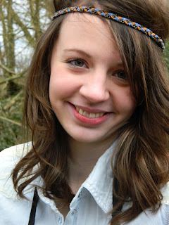
I
put this photograph into Black and White. I
then wanted to add more character to it, so I used the ‘History Brush’ tool to
remove the Black and White affect from the headband. It then looked out of
place so I decided to use the Hue Saturation option, by using this I could make
the colour change less obvious. This then made my overall photograph more
interesting.
Client Requirements - Fashion Shoot.
With
this photograph I resized the image, I did this so I could represent the 'Rule
of Thirds' better. I then put the whole image into Black and White. To then make
more affect and add more character to the overall image I decided to use the ‘History
Brush’ to then put the flowery skirt back into its original colours.
Client Requirements - Fashion Shoot.
Initially
I edited this photograph into black white, but I then decided to use the
‘History Brush’ tool to put the pink eyelash back into its colour. Also I then
added a filter to the overall photograph. I decided to use the ‘Poster Edges’
filter’, I applied it to the whole image because it added texture and
atmosphere. As well as that I used the ‘Rule of Thirds’ to make my photograph
more interesting.
Portrait Photography - Symmetry.
With
this photograph I edited it into Black and White. I then used the
Hue/Saturation option on Photo Shop to lighten the photo. I then cropped the
image so that the background was cut out, overall making the photo more
symmetrical.
Portrait Photography - Symmetry.
I
edited this photograph and put it into black and white. I then increased the
brightness and contrast. I also cropped the overall photograph to make it more
symmetrical and so the eyes were sitting on a horizontal intersection, using the Rule of
Thirds.
Portrait Photography - Symmetry.
This
photograph represents the use of symmetry. If the image was spilt into two
half, it would not be completely symmetrical but it still has the
characteristics of a symmetrical photograph. I edited this photograph into Black and White. I also increased the brightness and contrast. I then edited the black nail varnish because it was not as sharp as I wanted it to be. I did this by using the 'Paint' tool on Photo Shop.
Thursday, 29 March 2012
Portrait Photography - Symmetry.
This
photograph also represents symmetry. I applied a blur filter to the background
and used the ‘History Brush’ to remove it from the girl at the centre of the
image. I did this because it makes her then the focus point of my image and
really make the overall photo look more symmetrical.
Black and White Concept.
With
this image I edited it into black and white, increased the brightness and
contrast. Then I moved on to applying a filter. I used the ‘Noise’ filter. I then used the ‘History Brush’ to take the
affect off of the girl at the centre of the image.
Black and White Concept.
I
started off by changing the photographs adjustments into black and white. I
then went into filters and added blurred affect to the image. I used the ‘Lens
Blur.’ After this I wanted add more emphasis onto my camera in the photograph
so I used the ‘History Brush’ to then remove the blurred affect on just the
camera, making it the focus point of my image.
Black and White Concept.
With this photograph I started off by cropping out
a lot of the background. I then resized the image to make it larger. I then
used the lasso tool to surround the hand. I then filled in the brown background
with the pain tool in black. Once the background was all black I put the
photograph into black and white. I used the burn tool to make the line between
the hand and background blend. I then finished off by brightening the image.
Black and White Concept.
With this photograph I cropped it
to make the shoes and legs the main focus of the photograph. I did this by
using the ‘Rule of Thirds’. I also edited my photograph into black and white to match my Black and White Concept. I did this by using the Infrared filter. This
also then made the legs and shoes even more prominent. I then increased the
brightness slightly and the contrast.
Thursday, 8 March 2012
Wednesday, 29 February 2012
Friday, 24 February 2012
Subscribe to:
Comments (Atom)


